
Cherries are Red Skies are Blue
Size: 18" x 12"
This watercolor painting was created for the National Cherry Festival Poster Contest. The theme was farmer’s stand. The art piece is delicate with soft, bright colors. The composition follows the golden rule. Your eye flows in a spiral from the boy with his puppy around to the stand, the mother, and then the landscape. The feeling of nostalgia and the sun's warmth shines through the painting. The delicate linework and intricate details were painted with a thin round brush.
I started the creative process by researching the theme for the poster. Then I began sketching out some different ideas and layouts. I wanted the painting to feel rustic and replicate a sunny day in the county. The colors are bright and vibrant because I painted multiple layers with watercolors.
Cherries are Red Skies are Blue was selected to be in the top 30.
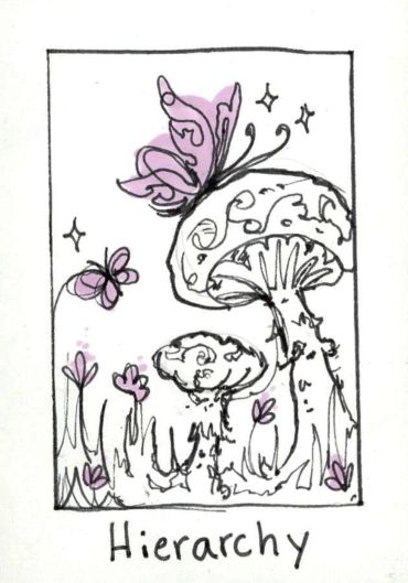
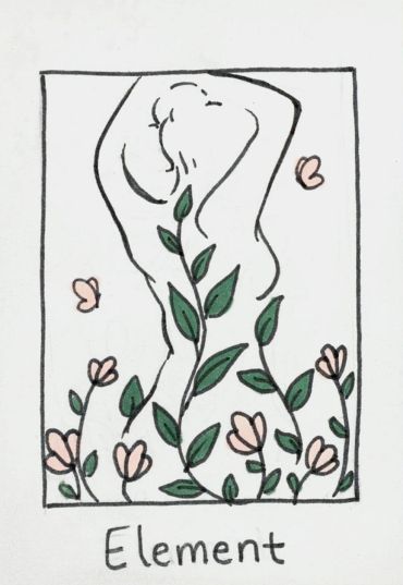
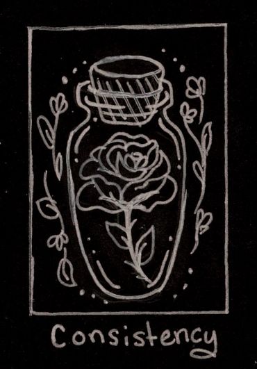
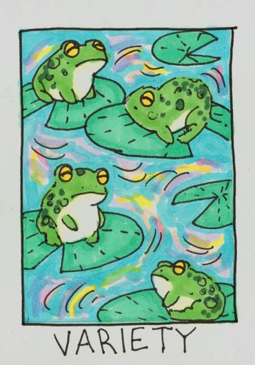
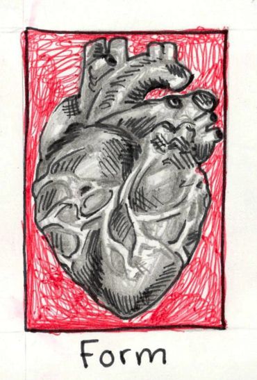
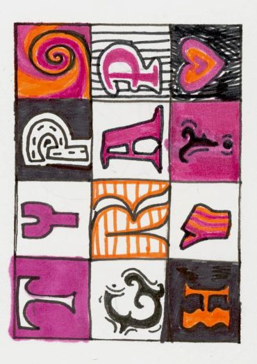
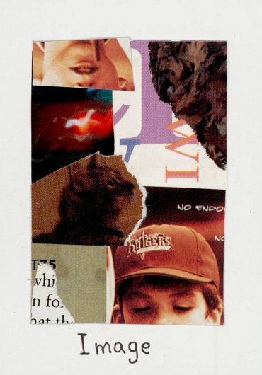
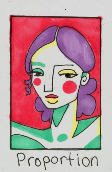
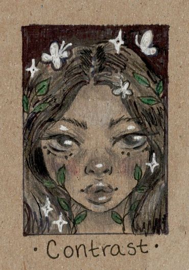
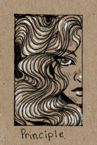
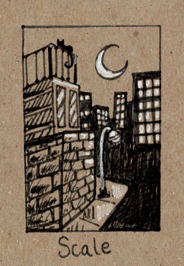
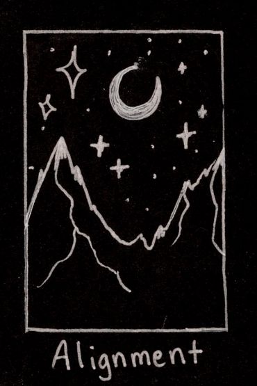
Elements and Principles of Design Cards
As Sweet as Cherries
Size: 12"x18"
This poster entry was created for the National Cherry Festival; the theme of the poster this year is “pollination”. The image was painted with watercolors. In the image, the two cherries are colored a rich red with light hues of maroonish purples and bright orangish red. The selection of colors in the cherries adds depth. On the cherry hanging to the left, there’s a honeycomb pattern towards the bottom of the cherry that’s dripping with sweet sticky honey. The yellow colors in the honey contrast with the reds of the cherries. The honey bees are a bright yellow with light tans and pops of oranges. Even though their wings are translucent they have some very light reflections of color from their surroundings in them. The thin cherry branches with blossoms wrap delicately around the cherries to create a frame. A round watercolor brush was used to make a splotchy texture on the petals so they look thin and curved. The outlines of the picture were made with a very thin round watercolor brush and black liquid ink. Applying just the right amount of pressure to the brush is crucial for making the lines thinner or thicker. Most of the strokes don’t fully connect so the painting can feel more free.


Monet Artist Replica
Size: 10" x 10"
This is a replica of Claude Monet’s painting “The Japanese Footbridge” on a sheet of canvas paper. The replica was made with acrylic paints. The original painting by Monet was used for color reference. The lighting in the painting has a faint blue tint, so in contrast, the shadows have a reddish hue. The purpose of this assignment was to recognize techniques used by the original artist and apply them to the replica. Monet was known for his impressionist style which consists of multiple loose and messy brush strokes to make one big picture. I find impressionism to be a very peaceful and carefree art style.

Product Ad
Size: 11"x8.5"
I took a photo of a sour patch kids package for this project. Then I put that photo into Photoshop and edited out the background. I also made a few adjustments to make the colors pop. To make the fun bubble text, I chose a font that fits well with the brand and then used the warp text tool. The red sour patch kid in the bottom left corner was image-traced in Adobe Illustrator and the logo in the right bottom corner I pulled from the internet.
28th Annual Scholarship Golf Outing Poster Entry
Size: 11"x17"
Before I started my design, I researched references of golfers and their equipment, as well as graduates in their gowns and caps. I used these references to make the representations in my poster accurate and precise. I also referenced other poster designs and styles to play off of in my poster.
The golf ball with grass on the poster piques the interest of any golfer. I added a textured halftone over the dark green to create the illusion of grass. The movement of the design draws your eyes in an “S” like pattern. The text “Scholarship Golf Outing” is highlighted by a drop shadow and a gradient in the text. These effects make the main text stand out from the rest of the poster. The other information is in a smaller font and aligned to the right side. This way, it won't challenge the main title and creates a hierarchy. The logo and “28th Annual” is above the title, but the “28th Annual” text is smaller than the title and on a ribbon. The date is also on a ribbon to keep the design consistent. Northwest Ed's logo is in the top right corner. While the logo isn't the first thing your eye goes toward, it is still a prominent element due to its size and proximity to the title.
There were many different versions made in the process of making this poster. I had a couple of ideas sketched out in some thumbnails. I came to this design by experimenting with Adobe Illustrator with various text arrangements. I saw this one reference with a golf ball placed by the edge of curved grass. I liked this idea because it would be a fun way to incorporate the golf theme into my poster. To tie in the scholarship aspect, I placed a graduation cap above the "28th Annual" ribbon and a graduate with her diploma standing by the date ribbon. I started with different fonts and colors. I changed the colors to a more sophisticated pallet to elevate the overall look of the design. The font I had originally felt too dated, so I looked for a new simple but elegant font on DaFont.com. I took that font into Illustrator and added the special effects.

Bio Infograph
Size: 11"x17"
This project is a Bio Infographic created in Adobe Illustrator. It’s an illustrated resume about me printed on cardstock. The design replicates an aesthetic workspace. The categories are on slips of paper to make them look like notes. Each category contains information about me. I created different patterns for each section to make the illustration interesting and varied. There are logos for each category that expresses the content. Some logos I drew in Adobe Illustrator, and some I image traced. One of the requirements for this project is for it to be two-toned or monochrome. My Bio Inphograph is two-toned, and I used different tints from my colors. The colors are baby blue and a soft tan. The colors make the artwork feel homey and calm.
To start this project, I took many personality tests to get information to put in the infographic. The Fonts I used were from DaFont. It took some experimenting to find the perfect fonts. I wanted the font to look handwritten yet neat. When picking the colors, my first choice was to make them a fresh green with a soft brown instead of blue and brown. I chose blue because it contrasted more with brown. The Polaroid photo in the Life section is a baby picture of me. To make the shot go with the color theme, I image-traced it and made it tints of blue. I set the image to multiply and placed a light tan rectangle behind the picture. This way, the picture looks like a faded Polaroid.
A scrapbook inspires the design. I wanted this illustration to represent me and my style. The display of the room is organized and cute, which is how I like my workspaces to be. I like crafts and taking notes, so I chose a scrapbook style.
Be Confident
Size: 8.5"x11"
The notebook cover is in US Letter format. The artwork displays bold, bright letters that spell the word confidence. The letters are pure white with a deep pink drop shadow. The drop shadow gives the illusion of depth and adds contrast. You can see the groovy 70’s style through the style of the letters and bright, warm colors. The background has thick curvy, colorful lines. This design lets the artwork flow. The simple lined details surrounding the word fill the whitespace. These details make the composition interesting.
To start this project, I first brainstormed words that described my vision for the future. The words I chose for this composition were confidence and joy. Using a mindmap, I came up with ideas that complimented the theme. From there, I sketched out some rough thumbnails with pencil and paper. After choosing a thumbnail I liked, I started looking at references for colors and typography design. I was drawn to the 70’s groovy style since it fit the theme well because it’s happy and bold. I then began to sketch my rough on my iPad in the art program Procreate. After deciding the placement of each component, I started the final piece, still in Procreate. I used the hard airbrush tool and the studio pen to create the portrait. The illustration was finished, so I emailed the jpeg file to my computer. I then brought the picture into Photoshop to edit the colors brighter, so they popped. I took the Photoshop file into Adobe Illustrator to correct the sizing and prepare for printing. The design is printed on 8.5”x11” label paper. To assemble the notebook, I peeled the backing from the label. Then I aligned it to the notebook and stuck it to the front cover.
The vision for this illustration is confidence. The definition of confidence is to have full trust in one’s powers and abilities. This artwork shows my vision for the future to become confident and face whatever will come my way.

27th Annual Scholarship Golf Outing Poster Entry

Size: 11"x17"
This project was designed for the North Ed Career Techs 27th Annual Scholarship Golf Outing. It was created in Adobe Illustrator and printed on cardstock paper. The three watercolor paintings were painted on a 6” x 6” sheet of watercolor paper. The colors in the background of the watercolor pieces are a very light wash and each painting includes the same colors in the artwork. This feature makes the paintings fit into the overall aesthetic, making the poster unified and connected. The design is a unique way of writing the word “Golf”. The hierarchy in the text has the Scholarship Golf Outing as the main focus of the image. The font for “Scholarship” and “Outing” is textured to add detail and fits the poster's aesthetic. Inside the word “Scholarship” there is a graduation cap at the tip of the “A” and the letter “I” is a diploma. This element in the letters incorporates the scholarship theme. Above the word scholarship is the “27th Annual” in red. The text is smaller since it’s not as important as the title of the text, but the red color makes it pop so it’s not lost. The poster is aligned and balanced making the poster look professional. The background color is a slightly darker shade of green in the watercolors to keep unity. Lastly, around the main text and images is a white shape
to add contrast and make the text pop.
Redeem Archetype T-shirt design


Snow Day Sticker Pack

Size: 5.5"x7.5"
The stickers were cut on vinyl sheets. There are eight stickers per sheet and 3 sheets per pack. The stickers are labeled as Snow Day because the theme is snow and the holidays. The style of all the stickers is cute and charming. The stickers are unified by smooth line art and pastel colors.
The process started with some simple sketches. I then refined them and scanned them onto my computer to image trace them in Adobe Illustrator. I tweaked the designs until they were sufficient. The coloring process was simple by just using the pen tool. They were printed and cut on the HP Latex 300 Series and the HP Latex 54 Cutter. I then cut the individual sheets by hand
and packaged them.
The Holiday Merry Market Place craft show where the stickers were sold. This project developed my time management skills. I had to calculate how to price my product based on time and resources.
Bio Button
Size: 3"x3"
For this art project, I combined two ideas of my favorite animal and favorite food. The young adorable orange kitten is wearing a fresh luscious strawberry as a hat. The strawberry is a bright red with crisp green leaves. Surrounding the kitten are mini strawberries and tiny scarlet polka-dots. There are also a few vibrant pink hearts that fill the white space in the composition.
Before I had created the finished piece, I made several thumbnails to play around with different compositions and ideas. My first idea was to have the kitten holding the strawberry, but then I decided that the kitten should wear it as a hat. I made this compromise because I felt that if the kitten had been holding the strawberry, it would hide the kitten from the viewer. Instead, I chose to make it more visible to the viewer's eye. The finished artwork was produced with Copic markers and a black fine-micron pen. The highlights and shines were drawn with a white gel pen. These details elevate the art piece.
This button displays my love for kittens and their adorable personalities. It also demonstrates my appreciation for sweet, fresh strawberries and how strawberries
reflect my lovable and soft personality.
